

Explore a spend scenario
How to read the saturation curve of a Performance Table row and estimate the modeled outcome of a different spend level.
The Saturation view of a row shows how the modeled outcome changes as spend changes. Use the view to estimate the outcome of a higher or a lower spend on one channel, tactic, or campaign.
How do you open the saturation curve?
Section titled “How do you open the saturation curve?”-
In the Performance Table, select the tab for the level that you want: Channels, Tactics, or Campaigns.
-
Select the arrow before the name of a row.
A panel opens under the row. If the row has a curve, the panel opens on Saturation. Do not select the name of the row. On the Channels tab and the Tactics tab, the name opens the campaigns of the row.
-
If the panel opens on a different view, select Saturation.
If the row has no curve, the panel opens on Compare. On a campaign row, the Saturation view then shows a message in place of the chart.
How do you read the chart?
Section titled “How do you read the chart?”The chart plots the modeled outcome against the spend for one period. The period is a day or a week, as the granularity of your models sets. The capture shows the details of one channel, with a scenario at 20% more spend than the current spend.
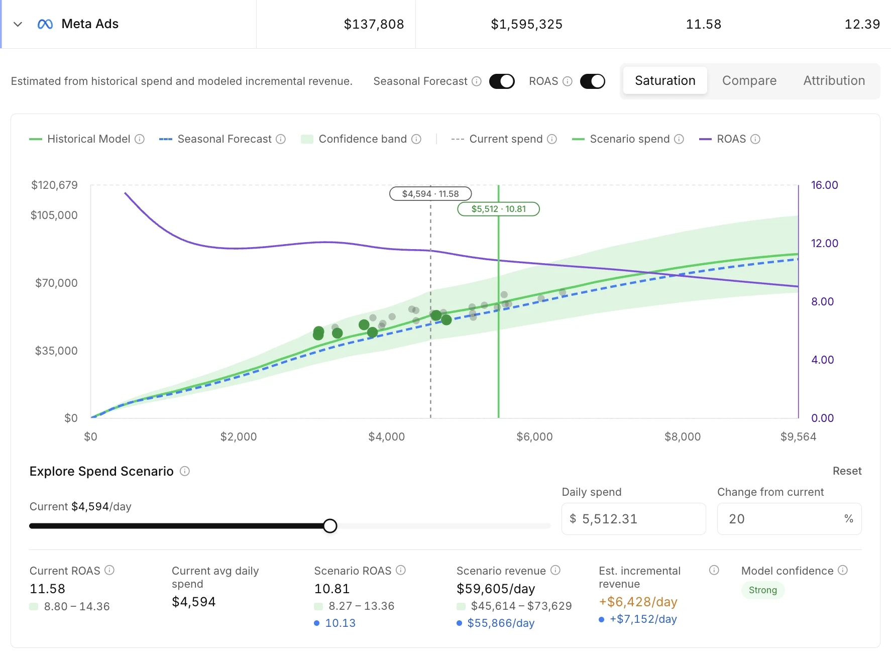
- Historical Model is the response curve from the history of the row.
- Seasonal Forecast is a projection of the curve for the days ahead, with expected seasonal demand. The tooltip of the switch gives the number of days that the projection covers. Turn the Seasonal Forecast switch on or off to show or hide the curve.
- The shaded band is the confidence range. A narrow band means a more certain estimate.
- Current spend marks the average spend of the row over the selected period.
- Scenario spend marks the spend level that you set.
The second switch has the name of the efficiency metric of your target. The switch is on when the panel opens and shows the efficiency at each spend level on a second axis. Turn the switch off to hide the axis.
Hold the pointer over the curve to read one point. The tooltip reads Observed for a spend inside the history of the row and Extrapolated for a spend beyond the history.
How do you test a different spend level?
Section titled “How do you test a different spend level?”The Explore Spend Scenario controls are under the chart. The capture above shows the controls and the results of one scenario.
-
Go to Explore Spend Scenario under the chart.
-
Move the slider, or type a spend for one period, or type a value in Change from current.
-
Read the results under the controls.
The results show the current and the scenario efficiency, the scenario outcome, and the estimated incremental outcome.
-
Read Model confidence before you act on the estimate.
-
To return to the current spend, select Reset.
What do the confidence values mean?
Section titled “What do the confidence values mean?”Model confidence rates how much to trust the curve at the selected spend.
| Value | Meaning |
|---|---|
| Strong | The range is tight and the actual results agree with the curve. |
| Moderate | The range is usable, or the history is too short to check the curve. |
| Directional | The range is wide, or the spend is beyond any spend in the history. |
To plan a budget across many rows at one time, use Media Forecaster. See Create and run a plan.